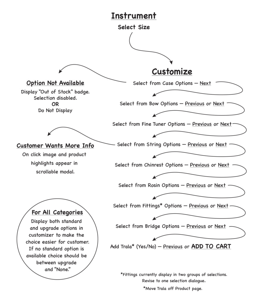
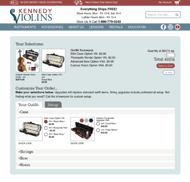
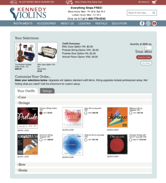
This project solved a couple of issues. First, in the old system, each Instrument and size variant also had a variant for case color. This made it difficult to manage inventory and availability. Also, the existing customer interface lacked feedback to the customer on availability when making selections. The revision solved these issues and resulted in more customers reaching the cart.
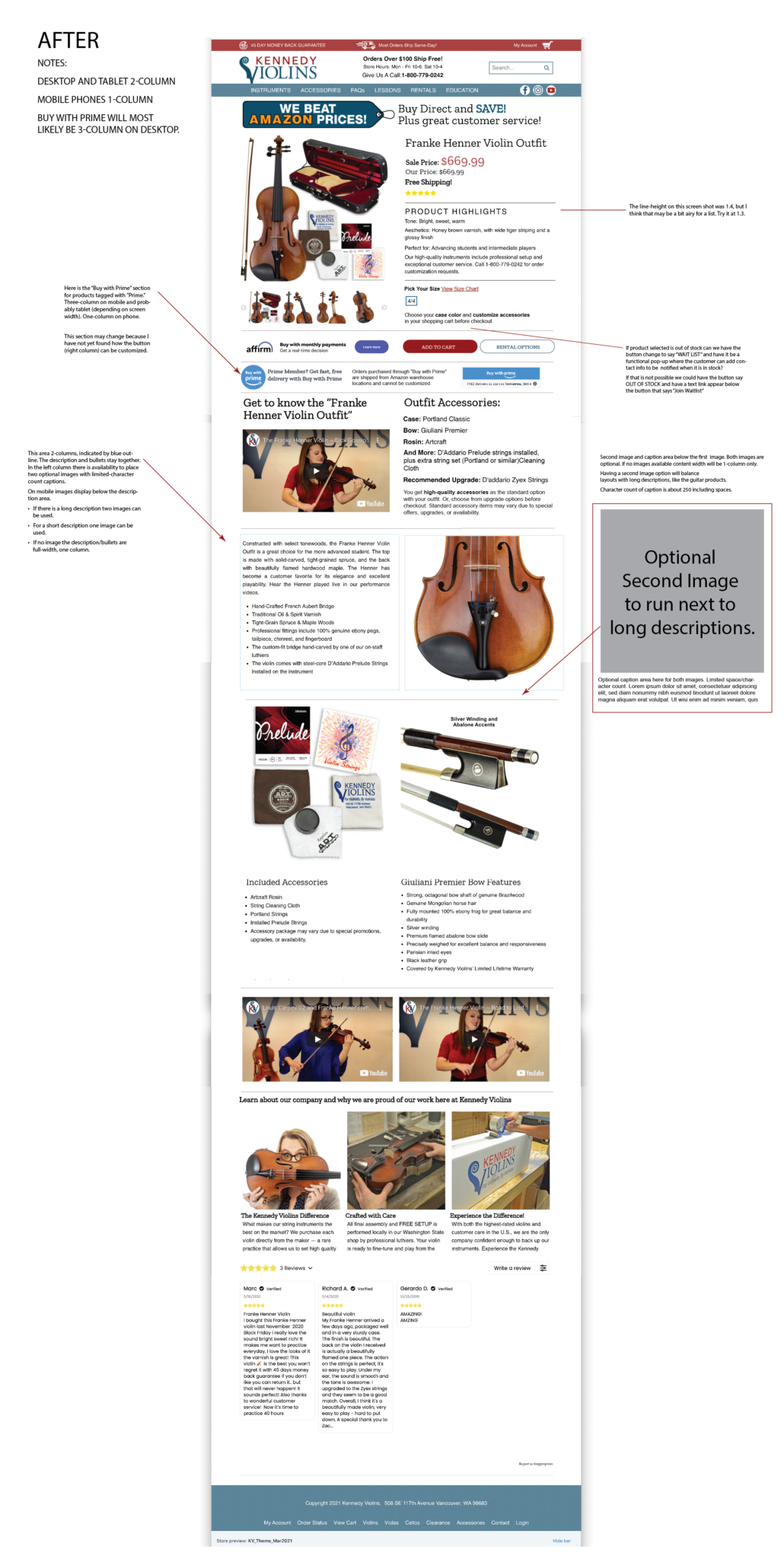
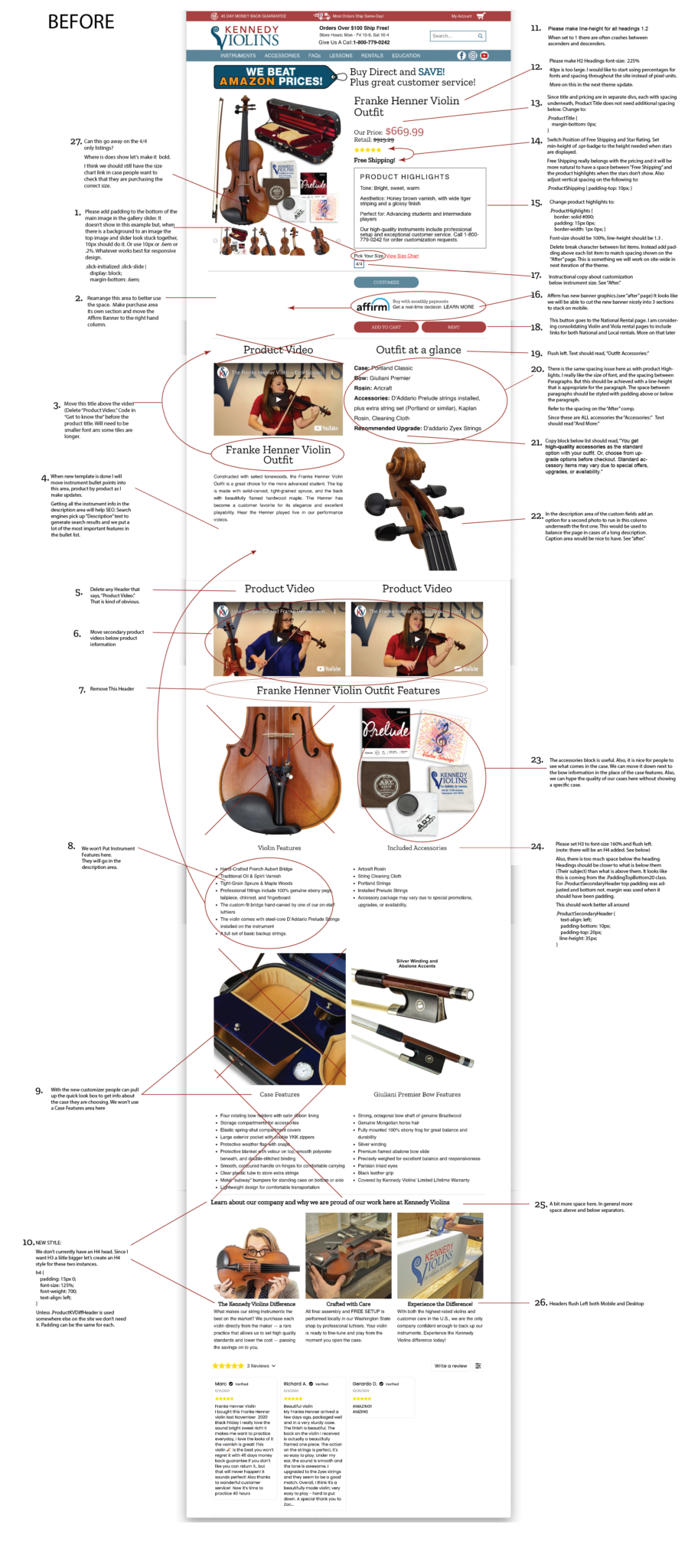
The new customizer also required changes to the existing product page template. This created an opportunity to clean up and improve some styling and spacing. This initial concept comp shows the desired “After” display on the first page of the PDF. The second page of the PDF shows the existing product page, with notes about what changes needed to be made. The new layout included changes needed to implement the new customizer interface. It also allowed for easier product page administration by eliminating the need to show included accessory details in the product page. These are instead spelled out as options in the new customizer experience. View comp pages in a larger size PDF.
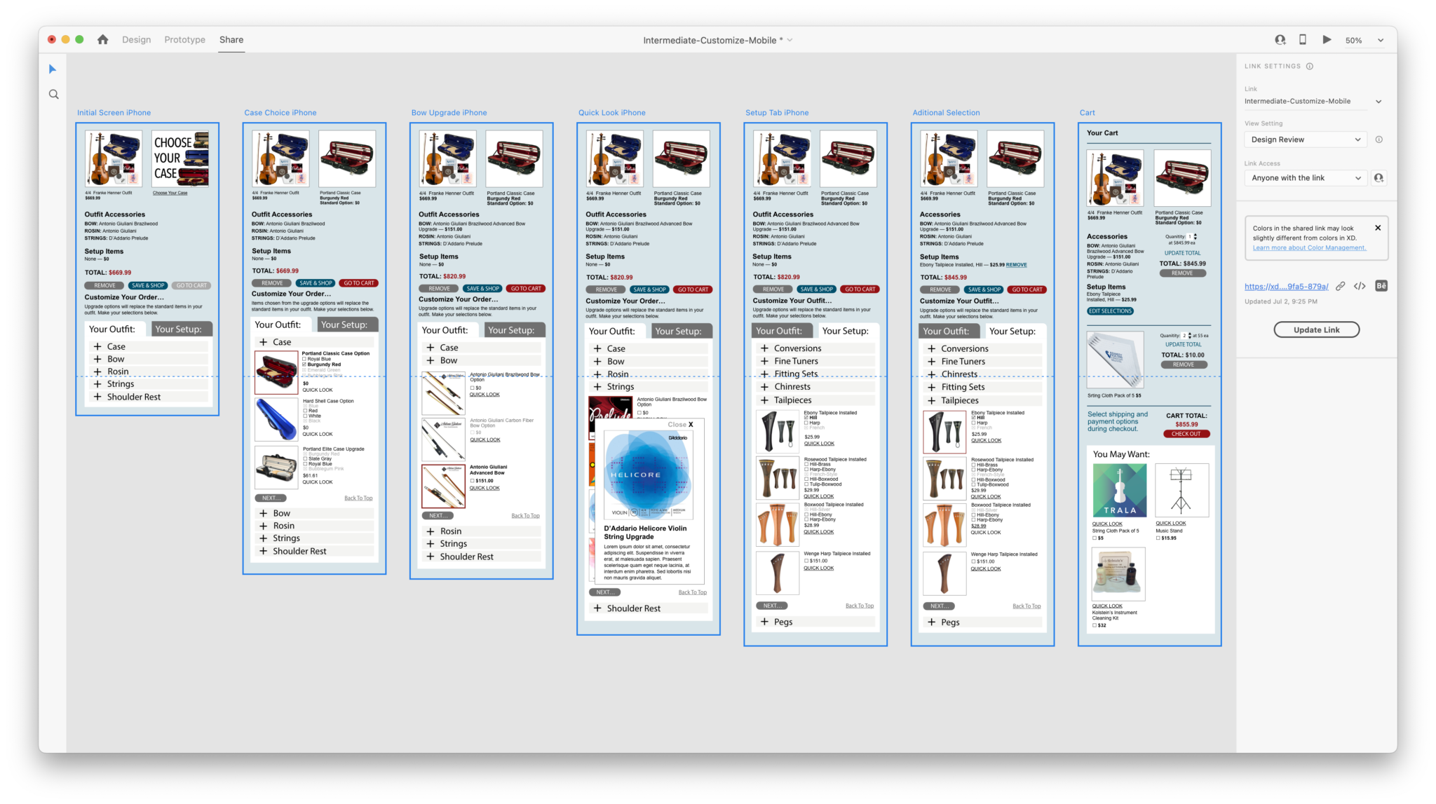
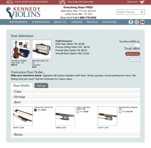
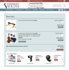
The following image is of the XD prototype of the user interface screens of the product customizer. Below are some of the finishes screens in desktop view.
View a PDF of some of the final changes for desktop, tablet and mobile screens.


