Typography and Headline Elements
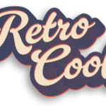
Here are a few typographic elements developed for use in digital promotions.

Here are a few typographic elements developed for use in digital promotions.
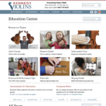
The Kennedy Violins Shopify site included a non-functional education center blog section. Although a few select posts got good traffic, most of the information was buried, without a way for the user to navigate to the information that they needed. This was, in part, due to the native shopify blog structure that only includes tags, …
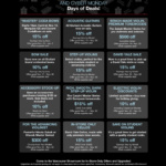
The image of the landing page above shows the active deals during Black Friday, 2023. Any paid social was linked to this landing page leading up to the sale, and to individual products during the sale. Roles: Concept, UX/UI, copywriting, design, and project management. Team members included the business owner, sales manager, and an offsite developer who created …
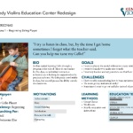
The Education Center project began with analysis of who the Kennedy Violin user is. This project included forming user profiles and stories, and addressing how the redesigned Education Center would address their needs. The presentation also included results of a survey of existing Kennedy Violin Social Media followers. You can read the entire presentation here, …
Continue reading “Presentation of User Stories and Research”
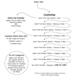
This project solved a couple of issues. First, in the old system, each Instrument and size variant also had a variant for case color. This made it difficult to manage inventory and availability. Also, the existing customer interface lacked feedback to the customer on availability when making selections. The revision solved these issues and resulted …
This set of feature icons was used on the Kennedy Violins home page. The set includes grayscale rollovers on desktop screens.
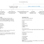
The Education Center on the Kennedy Violins website did not previously have an intuitive navigation system for users to find the information they needed. Most blog posts were simply not visible on the front end, and were not tagged appropriately for easy online display. To begin the process of revising the site structure, the first step was to plan how …
Continue reading “Information Architecture for an Education Center Blog”

Home page slider, social media, and online ads for use in the 2024 New Year initiative.

Here is a set of ads produced for use by one online publication. Role: Concept, design, and production. NOTE: I fully support free commerce. People of all political or cultural segments should have the opportunity to buy a violin for their child. However, I do not want to promote this particular online publication on my personal …
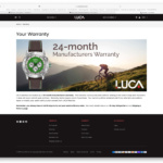
Here are a few landing pages created for the Luca Watch website. This project also included the initial front-end build, products, and product collections for the Shopify e-commerce site.