Typography and Headline Elements
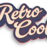
Here are a few typographic elements developed for use in digital promotions.

Here are a few typographic elements developed for use in digital promotions.
These icons were created for the navigation of a collections agency website.
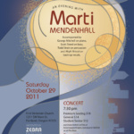
This poster was used to promote a concert and vocal workshop. Roles: Design and illustration.

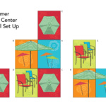
This is a collection of panels used in an elliptical display to draw attention to the seasonal outdoor furniture products in retail locations. Client: Fred Meyer

This vector illustration was created for a Coffee Shop opening and used on a poster and marketing collateral.
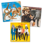
Willamette Week brought ’80s tunes to the zoo and played them for the animals. The article that was accompanied by these illustrations detailed the species preferences.
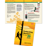
Targeted direct mail design and production.
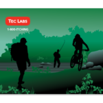
This graphic was produced for use as a back wall panel for a trade show booth. Roles: Design, Illustration, production.

This gentleman wanted an image he could use in promotional materials.